A COO at a telecom services company described his Monday morning to us recently. By 10 a.m., he had read three status decks - one from his RAN program team, one from his enterprise private network team, and one from his managed services group. Each used different formats, different KPIs, and different definitions of "on track." By 11 a.m., he was in a board prep call where the chairman asked a simple question: "How is the portfolio actually doing?"
He didn't have a confident answer. Not because his teams weren't working - but because the executive dashboards for telecom deployment governance he was relying on were manually assembled, retrospectively focused, and structurally inconsistent across business units.
This is the visibility gap most telecom executives carry. Status reaches them through formats designed for the people producing them, not for the people making decisions on them. By the time the dashboard shows a risk, the window to act on it has already narrowed.
This post is for the CEOs, COOs, program directors, and BU leaders who need real-time deployment intelligence - not next Tuesday's deck.
Weekly status reports were designed for a different operating tempo. They worked when deployment cycles ran in months and program sizes were small enough to summarize in a few slides. In a modern telecom program - multi-operator, multi-region, multi-deployment-type, multi-stakeholder — the weekly deck is structurally too slow and too narrow.
By the time leadership reads it on Monday, the data is already a week old. The site that was "on track" on Friday may have hit a blocker by Monday afternoon. The operator approval that was "submitted" last Wednesday may have been silently sitting unacknowledged for five days. The deck shows yesterday's reality, not today's.
The failure points in executive deployment reporting are predictable across organizations:
The instinct most organizations have is to ask for more reports - daily updates instead of weekly, additional KPIs, more granular breakdowns. This doesn't fix the structural problem. It just produces more retrospective data faster.
The real shift isn't reporting frequency or report volume. It's the difference between reporting and decision support. A decision-support dashboard answers the questions an executive actually has: which sites need attention, which stakeholders are underperforming, which programs are at risk of missing committed dates, where is margin leaking. A reporting dashboard tells you what happened last week.
This is the same fundamental structural issue we covered in why telecom deployment governance needs to move beyond spreadsheets - and in tracking telecom deployment SLAs before they become delays. Executive visibility is the layer on top of that governance: when the underlying data is structured and live, the dashboard becomes useful. When the underlying data is manually consolidated and retrospective, the dashboard is just a more expensive deck.
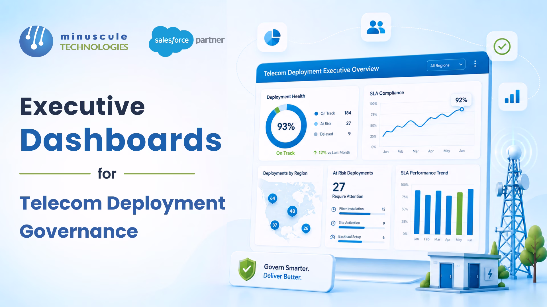
A governance-grade executive dashboard isn't a single screen. It's a layered view that answers different questions at different levels - portfolio, program, account, stage, and individual site - all from the same live data.
The architecture has to deliver five layers of visibility:
The top layer shows the metrics that go on the board deck - total sites in flight, sites at acceptance, sites at risk, pipeline-to-delivery conversion, average cycle time, and SLA adherence percentage. These are aggregate numbers, but they're calculated from live records - so the COO walking into a board call has confidence the number is current, not last Friday's.
The next layer shows where every active site sits in the Lead-to-Live deployment lifecycle - how many are in prequalification, design, approval, implementation, commissioning, or acceptance. This is the pipeline-to-delivery view that tells leadership where capacity is currently consumed and where bottlenecks are emerging.
This layer surfaces the proactive intelligence - sites approaching SLA breach, aging approvals, stale documents, overdue commissioning evidence. The same process clock data captured in SLA and process clock governance feeds this view directly. Executives see risk before it becomes delay, not after.
For multi-stakeholder programs, this layer shows operator response trends, vendor performance, system integrator delivery cadence, and customer responsiveness - across the portfolio and over time. The same data drives historical analysis covered in multi-operator telecom deployment governance, surfaced for executive-level accountability conversations.
Every aggregate metric drills down. A regional health indicator opens to the specific accounts and sites driving it. An SLA breach number drills to the specific stages, stakeholders, and approval owners involved. Executives don't need to ask their program managers to investigate - the dashboard tells them where to look.
The platform foundation sits on the Salesforce-native architecture covered across our governance pillars. Standard Salesforce reports and dashboards drive the visualization layer. Custom objects and Flow automation feed the data layer. The same infrastructure that runs sales reporting runs deployment reporting - eliminating the format and definition inconsistency that breaks manual consolidation.
When executive dashboards work, the impact shows up in three leadership-level outcomes.
Decision speed. Executives stop waiting for the next status meeting to act on risk. When the dashboard shows an aging operator approval or a stalled commissioning package, intervention happens in hours - not in next Tuesday's review cycle. Programs we've seen routinely accelerate average decision-to-action cycles by 60–80 percent once dashboards become the operating layer.
Stakeholder accountability. When vendor and operator performance is visible to leadership as data - not as anecdote - accountability conversations become factual. Quarterly business reviews, contract renewals, and partner negotiations are informed by structured performance history. This typically reshapes commercial conversations significantly.
Board confidence. The COO who walks into a board call with a live dashboard showing portfolio health by deployment type, region, account, and SLA status carries different credibility than the one with a 14-slide deck. Boards reward leaders who can answer their questions in real time.
For program organizations managing 100+ concurrent sites across multiple deployment types, the combined impact of faster decisions, stronger accountability, and board credibility shows up in customer retention, partner economics, and the funding decisions that determine which programs scale next.
At Minuscule Technologies, we build Salesforce-native executive dashboards on top of structured telecom deployment governance. The dashboards run on live deployment data - sites, stages, approvals, SLAs, evidence, acceptance - captured automatically through workflow rather than through manual consolidation.
Portfolio health, stage progress, SLA risk, stakeholder performance, and account or regional drill-down all live in the same dashboard layer. The infrastructure connects directly to the Lead-to-Live telecom deployment governance model and the Salesforce-native RAN deployment governance architecture - because executive visibility is the natural output of governed deployment data, not a separate reporting initiative.
That's the difference between executive dashboards that drive decisions and reports that get read in board prep meetings.
An executive dashboard for telecom deployment governance is a live, layered view of portfolio-level deployment health - built on structured workflow data rather than manually consolidated reports. It answers the questions executives actually have (which sites need attention, where is risk emerging, which stakeholders are underperforming) in real time, with drill-down to individual sites, accounts, regions, and stages.
Weekly status reports are structurally too slow, too narrow, and too inconsistent for modern multi-operator, multi-region telecom programs. By the time leadership reads them, the data is up to a week old. Format inconsistencies across business units require manual normalization. And the reports show what happened, not what's about to. Executives reading them are managing yesterday's risk - not preventing tomorrow's.
Executive dashboards typically include pipeline-to-delivery conversion, sites at each lifecycle stage, SLA risk and aging analysis, RF design backlog, implementation progress, commissioning readiness, closeout status, acceptance aging, stakeholder performance (operators, vendors, SIs), and regional rollout health. Each KPI is calculated from live records and drills down to the underlying sites driving the metric.
Reporting tells you what happened. Decision support tells you what to do next. A reporting dashboard shows SLA adherence as a number; a decision-support dashboard shows which sites are at risk of breach, who owns the next action, and how long the window to act is. The shift requires structured workflow data - captured as a side-effect of execution, not as a separate reporting exercise.
Yes. Salesforce supports configurable reports and dashboards built on live records - the same infrastructure that runs sales reporting also runs deployment reporting. When deployment workflows (prequalification, design, approval, implementation, commissioning, acceptance) run inside Salesforce, the dashboards inherit the live data automatically. The same architecture covered in Salesforce-native RAN deployment governance makes executive visibility a natural output.
Aggregate metrics on the dashboard are calculated from underlying records. Clicking a portfolio-level number filters to the contributing program records, then to the specific accounts, then to the sites. An executive looking at a red SLA indicator can drill from portfolio to region to account to site to the specific stakeholder owning the overdue action - without asking a program manager to investigate.
When operator response trends, vendor performance, and system integrator delivery cadence are tracked as data, accountability conversations move from anecdotal to factual. Quarterly business reviews, contract renewals, and partner negotiations are informed by structured historical performance. Stakeholders who consistently run late see it in their own performance data - and the conversations that follow are more productive than impression-based feedback.
Programs with live executive dashboards typically see 60–80 percent acceleration in decision-to-action cycles, meaningful improvement in stakeholder accountability outcomes, and stronger board-level confidence in program reporting. For organizations managing 100+ concurrent sites, the combined impact shows up in customer retention, partner economics, and the funding decisions that determine which programs scale next.
The companies winning telecom deployment today aren't the ones with the smartest field teams or the most senior program managers. They're the ones whose executives can see what's happening across their portfolio in real time - and act on it before the next status meeting.
If your leadership is still reading deployment health off slides assembled by program managers, you're operating a week behind the organizations that govern with live data. The dashboard is the operating layer. The deck is the artifact of not having one. See your portfolio in real time - book an executive dashboard walkthrough.
You've seen what's possible. Now, let's make it happen for your business. Whether you need an end-to-end Salesforce solution, a complex integration, or ongoing managed services, our team is ready to deliver.
Schedule a Free Strategic Call


